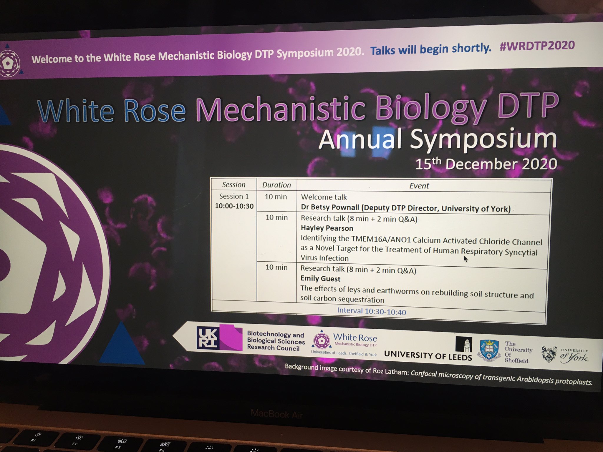
While 2020 was an unprecedented year for conferences, 2021 looks to be no different. With conferences going virtual, such as the WRDTP symposium in December, many of you may have had the opportunity to present a poster in this unique style but there are a whole host of upcoming opportunities to show off your research this year.
But how do you design and present a great poster?
In this blog we give a run-down of our top tips for your poster presentation and, in case you missed it, a summary of the ‘Research poster workshop’ hosted by Dr Emily Goodall, part of the monthly online skills sessions for WRDTP students back in November.
So first a question.. why present your work as a poster? Well, posters are a great way of condensing your research into key points which is not only incredibly helpful for you in becoming a great science communicator, but poster sessions also allow people to see lots of the exciting parts of different research projects in a short amount of time. These sessions also tend to be far less formal, and can be a great way to make collaborations.
On 18th November 2020, Dr Emily Goodall held a research poster workshop as part of the online skills sessions series. It was a great insight into how to plan your poster, tailor your message to the audience and optimise the overall design.
The session started with an exercise I’d recommend you to all to try it out! Give yourself 10 minutes and write down one sentence for each of these questions.. see if you can challenge yourself!
- Why is your research important?
- What are the objectives of your work?
- What have been your findings?
If you’d like more information, you can request the powerpoint slides directly from Emily (e.goodall@sheffield.ac.uk).
Top 10 Research poster tips
- Check the format suggested by the conference. Some may have different size requirements. If you are presenting an online poster why not consider landscape orientation?
- Sketch your poster design plan on paper first. It really helps to know which sort of sections and data you want to put in your poster before you start messing about on
- Use a QR code which can link to your group website, a youtube pitch for your poster or even your published paper
- Stick to a colour scheme, don’t use an image as a background (it can be too distracting). Why not try printing it out in A4 in greyscale to see how accessible it is to those who may be visually impaired.
- Make sure you put a limit on the number on the word count. Although it can be challenging, a maximum of 250 words should be sufficient to get your main points across.
- Choose an interesting title and display it so that it stands out.
- Make the flow easy for the reader to follow. But don’t feel like you need to stick to traditional subheaders such as ‘results’ or ‘methods’ – be creative!
- Include a few interesting images and graphs but don’t overload the page. Why not try out infographics rather than your traditional table of data?
- Check that you have permission to use figures and images you haven’t produced. Discuss with your supervisor and/or industry collaborator as to what data you are allowed to share publicly.
- Practice your pitch! Often we can get a sudden sense of dread when someone comes over but it’s a big no-no to read directly off the poster. Introducing yourself and giving a succinct and interesting two-minute pitch of your work (while pointing to bits of your poster) is most effective way of getting your message across to the audience.
And when planning your poster remember to focus on the four big questions people want to know..
Why? How? What? So what?